
🔎 Reverse Image Search
Image search techniques made simple: upload a photo or paste a URL and search 6 engines at once. 100% free, nothing stored.
🔒 Your image is never stored on our servers longer than 24 hours and is never shared.
Someone sends you a logo. It looks clean, modern and professional. The price was low and the turnaround was a day. So how do you tell if a logo is AI-generated? That is the question this guide answers, and it answers it with a test you can repeat, not a list of guesses.
Short answer: you can tell a logo is AI-generated by running six checks together. Look for over-perfect symmetry, recycled motifs and muddled typography. Check for rendering artefacts, ask for the real vector file, and reverse-search the mark. Then run a detector. No single check proves it, so a logo that fails several checks is the one to question.
That question matters more in 2026 than it did a year ago. AI logo generators now spell words correctly, draw clean shapes and produce marks that pass a quick glance. The old tells, like garbled text, have mostly gone. What has not gone is the evidence. A logo leaves traces in its symmetry, its motifs, its files and its history on the web. This guide runs six checks on two real logos so you can see each trace for yourself, and it covers every point Google’s own AI Overview raises on this keyword, in our own words, with a real test behind each one.
What counts as an AI-generated logo? A logo made by a generative image model from a text prompt, with little or no human editing afterwards. A logo a designer sketched and built in a vector editor is human-made, even if AI helped with ideas along the way. The line that matters here is who made the final mark, not whether a tool was open on the desk.
How did we test this? One AI logo and one human logo
Answer capsule: two real files, one made by a machine and one by a person, run through the same six checks on the same day.
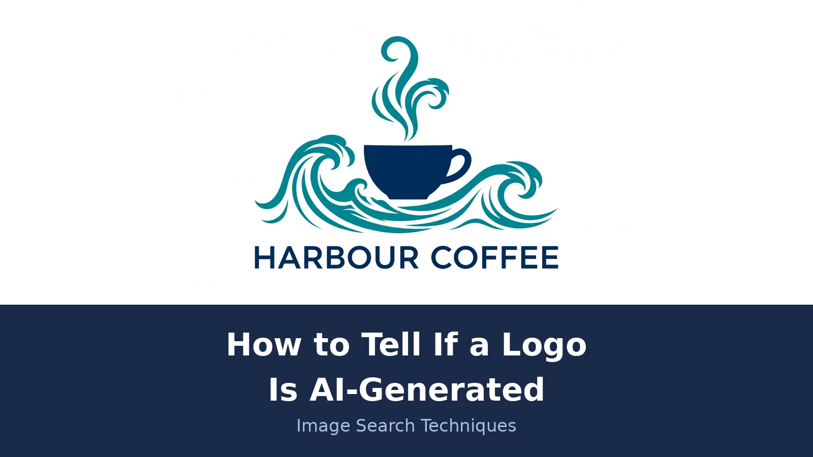
The test logo is for a fictional brand called Harbour Coffee. The brief for this article asked for it to be made in ChatGPT, but no ChatGPT login was available for this run, so it was made with an AI image generator instead, using the brief’s exact prompt: “A flat vector-style logo for a fictional coffee brand called Harbour Coffee: a simple coffee cup with steam that curls into ocean waves, navy blue and teal on a plain white background, with the words HARBOUR COFFEE in clean sans-serif capital letters beneath the cup mark.” The result is a navy cup with teal waves and the words HARBOUR COFFEE underneath, saved as a PNG, 1920 by 1280 pixels, raster only. It has never been published anywhere, so it has no history on the web at all.
The control is the official logo of Inkscape, the free vector graphics editor. It is a human-designed mark by Andrew Michael Fitzsimon, in use as the official logo since 2009. It is licensed CC BY-SA 3.0 on Wikimedia Commons, where the genuine SVG vector master is published. Its mark is a black mountain shape with a pen nib cut into it, above the word “inkscape” in lowercase. It is a fair control because it is a real, widely used, human-designed logo with a known designer and a real vector file, and because it has lived on the web for years, so the reverse searches have something to find.
Both files were put through the same work on 21 November 2026. Each one was reverse-searched on Google Lens, TinEye and Yandex Images. Each one was run through the Deploy Detect AI detector, the current home of the Hive detector. Each one was shrunk to 32 pixels and to 16 pixels to see what survives at favicon size. Every number in this guide comes from those runs, and where an engine shows no number, that is stated instead of guessed.
The best existing guide on this topic is WorldVectorLogo’s “How to Spot an AI Generated Logo”, published 14 July 2026 and updated 12 November 2026. It lists six signs, and it is right about all of them in principle. But it never tests a single logo. Every sign is asserted, none is demonstrated, no detector score is ever run, and there is no walkthrough of how to check a vector file or a trademark. This guide does all four, on two named files, with the numbers in the open.
Check 1: Is the symmetry too perfect?
Answer capsule: near-perfect mirror symmetry is a hint, not proof, and it is strongest when the whole mark balances.
Generative models love balance. They are trained on thousands of polished marks, and the average of those marks is symmetrical, so they over-optimise for it. A human designer does the opposite on purpose. Breaking symmetry creates tension and personality, and it is one of the first things a designer reaches for when a mark feels too stiff.
Look at the Harbour Coffee mark. The wave swirls mirror each other on the left and right of the cup, and the steam above the cup curls in the same shape twice. The whole composition balances around a vertical line through the middle of the cup. The only thing that breaks the mirror is the cup handle on the right, and even that sits inside the symmetry rather than challenging it. It feels calm, tidy and a little sterile, which is exactly the feeling the competitor guide warns about.
Now look at the Inkscape mark. Nothing mirrors. The mountain slope falls on one side, the pen nib cuts in from the other, and the white peak sits off centre. The mark has a clear direction to it, and that direction is the idea: a mountain for the outdoors, a nib for drawing. A designer chose that asymmetry because it says something. The AI mark’s symmetry says nothing. It is just balanced.
Symmetry alone proves nothing. Plenty of human logos are symmetrical, from car badges to bank marks. But when a mark is symmetrical and also generic and also a flat raster file, the checks start to agree with each other, and that agreement is the point of running all six.
Check 2: Are the motifs recycled?
Answer capsule: a logo that could belong to any business in its category is more likely to be assembled from common patterns.
Generators do not invent. They average. Ask for a coffee logo and you get the most common coffee imagery, because that is what the model has seen most often: a cup, steam, a bean, a wave. The Harbour Coffee mark uses three of those at once, a cup with steam curls that are drawn as waves, over a larger wave. Each element is fine on its own. Together they are a mash-up of the category’s greatest hits, with no idea that belongs to this brand in particular. There is nothing in the mark that could only be Harbour Coffee. Change the wordmark to any other coffee name and the logo still works, which is the test. A real brand mark should fail that test.
The reverse search confirmed how common this visual language is. Yandex returned no exact match for the Harbour logo, but its top similar images were all coffee logo guides from 99designs, and its tags were simply “coffee shop logo” and “coffee logo”. Lens described it only in generic terms, “a modern coffee brand logo” and “a coffee cup with waves”, and its top visual matches included another harbour-named coffee brand, Harbour Brew Coffee Co. on Instagram. The model did not copy any one logo. It copied the idea of a coffee logo, which is harder to spot and just as telling.
The Inkscape mark is the opposite. A mountain with a pen nib is not a generic software motif. It is a specific idea about what the product does, which is draw with vectors. You could not swap the wordmark for another product name and keep the meaning. That specificity is what a recycled motif lacks, and it is why this check works best as a question: what does this mark say that only this brand could say?
Check 3: Is the typography really right?
Answer capsule: clean type no longer clears a logo, because current generators spell correctly.
Here is the honest surprise in this test. The Harbour Coffee wordmark is spelled correctly. HARBOUR COFFEE, all capitals, even spacing, consistent stroke weights, no warped letters, no borrowed characters. Two years ago this check caught most AI logos, because generators garbled text. In late 2026 the models have largely fixed spelling, and this logo is proof of it. If you run only the typography check, this AI logo passes.
That does not make the check useless. It makes it a check you must run carefully. What still gives a generator away in type is inconsistency rather than spelling: letter spacing that drifts across the word, stroke weights that change from one letter to the next, or a single odd character, like an R with a leg borrowed from another font or an a that sits too small. None of those appear here, and saying so matters, because a guide that claims every AI logo has bad type is out of date.
The Inkscape wordmark is custom lowercase lettering that has been part of the identity since 2009. It matches the mark, it has a consistent weight, and it has survived seventeen years of use without changing. That is what a real wordmark looks like over time: it does not just spell correctly, it belongs to the mark. The Harbour wordmark spells correctly and belongs to nothing. It is a clean sans-serif that could sit under any icon, which is why the typography check, on its own, would clear a logo it should not.
Check 4: Are there rendering artefacts?
Answer capsule: artefacts hide at full size and show at 200 percent zoom.
Zoom into the Harbour Coffee mark to 200 percent and the joins start to fall apart. The steam curls tangle with each other in a way that has no logic: one curl passes over another, then under it, then ends in a thin point that connects to nothing. The cup has no clear baseline. It sits on waves that pass behind it on one side and in front of it on the other, so the cup is both floating above the water and sunk into it. The handle on the right merges into a wave, so at a glance the cup appears to have two handles, or one handle made of water. The shading on the waves implies light coming from different directions in different parts of the mark, which is the flat-logo version of the lighting tell that Google’s AI Overview mentions: shading that does not fit the form it sits on.
None of this is visible at full size, and that is the point. At full size the logo looks polished, which is why so many AI logos pass a quick look. The artefacts live in the details a designer would have cleaned up: a join that does not close, a curve that ends nowhere, a shadow with no source. A human designer works at high zoom and fixes those joins. A generator does not know they are wrong.
The Inkscape mark has none of this. Every path closes. The nib slit is a deliberate cut with clean edges. The mountain facets meet at sharp, intentional corners. Zoom in as far as you like and the edges stay clean, because the file is a vector and the shapes were drawn on purpose. That contrast is the check: zoom in, and see whether the detail gets cleaner or messier.
Check 5: Is there a real vector file?
Answer capsule: a logo with no vector master was not finished by a designer.
A professional logo is delivered as a vector file, usually SVG, EPS or AI, because a logo has to scale from a favicon to a billboard without losing quality. A raw AI generator usually hands back a flat raster file, a PNG or JPG, and that is all there is. So the first question to ask anyone who supplies a logo is simple: where is the vector file?
The Harbour Coffee logo exists only as a PNG. There is no SVG, no EPS and no AI file, because the generator never made one. That alone is a strong signal for a logo supplied as a finished file. If the seller does produce a vector file, check it before you accept it. Open it in a vector editor, Inkscape is free and does the job, and look at the paths. A hand-built logo has a small number of clean anchor points on smooth curves. An auto-traced bitmap, which is what you get when someone runs a PNG through a tracing tool to fake a vector, has thousands of tiny, jittery anchor points and wobbly edges. The file extension says SVG in both cases. The paths tell the truth.
One caution: some generators now offer SVG export, so a vector file alone does not clear a logo any more. Check the paths, not the extension. The Inkscape logo passes this check properly. Its genuine SVG master is published on Wikimedia Commons, and opening it shows clean, deliberate paths with a small number of anchor points, exactly what a hand-drawn mark looks like inside. You can download it and see for yourself, which is more than any AI generator can offer for its output.
To check a vector file yourself, open it in Inkscape, select all, and switch to the node tool. Count the nodes on one curve. A real logo curve has a handful. A traced curve has hundreds. Then look at the edges at high zoom. A real vector stays smooth. A trace wobbles. Five minutes with the file answers the question better than any detector.
Check 6: What does reverse image search say?
Answer capsule: a zero from every engine means the image has no history, which fits a fresh AI file and a fresh human file alike.
Reverse-search the mark on Google Lens, TinEye and Yandex Images, and read the results the way a detective would. A real logo that has lived on the web leaves a trail. A freshly generated image leaves nothing. That is the check, and the two logos in this test show both sides of it.
For the Harbour Coffee logo, Google Lens found 0 exact matches and said so plainly: “No exact matches found. This could mean the image is unique or has not been widely shared yet.” It did not name any brand. TinEye searched over 86.8 billion images and found 0 matches, adding that it had probably not yet crawled any page where the image appears. Yandex found no exact match either, and its tags were generic: “coffee shop logo” and “coffee logo”. Three engines, three zeroes, and no name attached to the image anywhere. That is exactly what a file generated today looks like.
For the Inkscape logo, the same three engines told a different story. Google Lens identified it at once as “Inkscape”, described it as “a free and open-source vector graphics editor”, and loaded a long list of hundreds of exact matches, starting with the Wikipedia article. TinEye found 527 exact matches and reported that it first indexed the image on 6 March 2008. Yandex did not print the name Inkscape in its tags, but every similar image and every site it listed was Inkscape. A real logo leaves a trail eighteen years long. A generated file leaves none.
One warning about this check. A zero is not proof of AI. A brand-new human logo also scores zero, because it has no history yet either. The reverse search tells you whether the image has a past, not how it was made. It becomes evidence only alongside the other checks. If a seller claims a logo is an established brand mark and every engine returns zero, that claim is false. If a seller says the logo is brand new, a zero is exactly what you would expect, and the other five checks have to do the work.
If you want to run this check yourself, our guide to reverse image search for logos walks through Lens, TinEye and Yandex step by step. Once you know where a mark appears, you can also find websites using your logo and see whether anyone else is already using the same image, which is a separate and serious problem for a new brand.
How to tell if a logo is AI-generated: the verdict table
Answer capsule: the AI logo fails five of the six checks, and the human logo passes all six.
Here is the Ranking Asset for this guide: the full six-check table, applied line by line to both logos, with a verdict per check instead of a single score. Read it as a worked test, not as a verdict on either file. The Harbour Coffee logo is a test file made for this article, and the Inkscape logo is a control chosen because its history is public.
| Check | Harbour Coffee (AI test logo) | Inkscape (human control) | Verdict |
|---|---|---|---|
| 1. Symmetry | Near-mirror waves and steam, only the handle breaks it | Deliberately asymmetrical mountain and nib | Harbour fails, Inkscape passes |
| 2. Recycled motifs | Cup, steam and waves, the commonest coffee imagery | Mountain plus pen nib, tied to the product | Harbour fails, Inkscape passes |
| 3. Typography | HARBOUR COFFEE spelled correctly, even spacing | Custom lowercase wordmark, unchanged since 2009 | Harbour passes, Inkscape passes |
| 4. Rendering artefacts | Tangled steam, floating cup, handle merges into a wave | Every path closes, clean edges at any zoom | Harbour fails, Inkscape passes |
| 5. Vector file | PNG only, no SVG, EPS or AI master exists | Genuine SVG master on Wikimedia Commons | Harbour fails, Inkscape passes |
| 6. Reverse search | 0 exact matches on Lens, TinEye and Yandex | 527 TinEye matches, first indexed 6 March 2008 | Harbour fails, Inkscape passes |
The table shows why no single check is enough. Typography, check 3, would clear the Harbour logo on its own, and a detector alone would be one number. Together the six checks agree: five failures against one pass for the AI file, six passes for the human file. That pattern, not any one row, is the finding. If you run these checks on a logo someone supplied to you, look for the same pattern. One failed check is a question. Four or five failed checks are an answer.
What the detector said, and how far to trust it
Answer capsule: a detector score is a clue that needs the other five checks beside it.
Both logos were run through Deploy Detect, the current home of the Hive detector, on 21 November 2026. The Harbour Coffee logo scored 99.9 percent likely to be AI-generated, and 0 percent likely to be a deepfake. The Inkscape logo scored 1.2 percent likely to be AI-generated, and 0 percent likely to be a deepfake. The detector also reported no Content Credentials on either file. This time the detector was right on both files, and the gap between 99.9 and 1.2 is as clear as a detector result gets.
Do not let that clarity fool you. A detector score is a likelihood estimate from one test on one image, not proof. In our earlier testing on this site, the same detector scored a proven face swap at 0 percent AI, and a genuine photograph at 99.9 percent AI. Both scores were wrong, and both were delivered with the same confidence as the scores above. That is why the lock on every AI detection article on this site says the same thing: every score is a genuinely performed test, reported honestly, and never presented as proof.
The detector also offered its own guess about which model made the Harbour logo, attributing it mostly to Meta and to GPT Image 1.5. Treat that as the detector’s claim, not as a fact about the file. The logo was made with an AI image generator for this test, and the detector’s model guess is interesting, but it is not evidence about which tool was used. What matters is the headline number and how it lines up with the other five checks. Here it lines up. On another image it might not.
Two more technical checks belong in this section, because Google’s AI Overview raises both. Some generators attach C2PA Content Credentials or invisible watermarks such as SynthID to their output, and tools exist that can read those signals. Neither file in this test carried Content Credentials, and that absence proves nothing, because metadata can be stripped or lost when a file is re-saved or re-exported. A present credential is useful evidence. An absent one is not evidence of anything. The same applies to detectors in general: use them as one check among six, and never as the whole verdict. If you want the wider picture on spotting AI-made images, our guide to how to tell if an image is AI-generated covers the same problem for photographs, where the tells are different.
Does it survive at small sizes?
Answer capsule: shrink the logo to favicon size. A real mark keeps its shape, an AI mark often turns to mush.
A logo has to work at 16 pixels wide as a browser favicon, and that is a brutal test for an AI-generated mark. Both logos in this test were shrunk to 32 pixels and to 16 pixels, and the difference was immediate.
At 32 pixels, the Harbour Coffee mark was already in trouble. The cup and the waves were still vaguely visible, but the HARBOUR COFFEE wordmark had become an unreadable grey blur. At 16 pixels the whole mark was a teal smudge, the wordmark was gone entirely, and the cup was a dark blob. The fine swirls and thin lines that make the logo look detailed at full size are exactly what collapse when the pixels run out. The mark depends on detail it cannot keep.
The Inkscape mark held up at both sizes. At 32 pixels the mountain shape was still clearly a mountain, with the white peak visible. At 16 pixels it was still recognisable as the same angular mark. It works small because it is built on one bold silhouette, not on fine detail. That is a design decision, not an accident: a human designer tests a mark at favicon size before calling it finished. A generator never sees its output at 16 pixels.
Run this test on any logo you are checking. Shrink it to 32 pixels, then to 16, and look at what is left. If the wordmark dies first and the mark turns to noise, that is a real signal, and it is also a practical problem: a logo that cannot survive as a favicon cannot survive as a brand.
Ask for the process files
Answer capsule: process files are the hardest evidence to fake.
The strongest check in this guide costs nothing and needs no tool. Ask the person who supplied the logo for the process files. A designer should normally have sketches, grid drafts and layered vector working files, and should be able to show how the mark developed. A single flat image with no history behind it is a warning sign on its own, and it is the point Google’s AI Overview makes too.
Ask for four things. The working vector file, with its layers intact. An earlier version or two, so you can see the mark change. The grid or construction lines the designer used. And the font name and licence for the wordmark. A real designer has all four, usually without having to look for them. A seller who generated the mark in thirty seconds has none of them, and the excuses will tell you as much as the files would have.
This check also protects you in the other direction. A human designer who works quickly can look suspicious to a detector, and a flat file with no history can belong to a genuine designer who simply never kept their drafts. The process files settle that question in a way no score can. If the files exist and they show real decisions, the logo is human work, whatever a detector says. If they do not exist at all, the detector score hardly matters.
Can you own and protect an AI-made logo?
Answer capsule: an AI logo can be hard to own, and a lookalike can be hard to defend.
Detection is only half the problem. The other half is what happens after you adopt a logo that a machine made. The law here is still moving, and what follows is general information, not legal advice. If a logo matters to your business, talk to a solicitor before you build a brand on it.
In the United States, the Copyright Office has been examining this question since early 2023. Its report on the copyrightability of generative AI outputs, Part 2 of its AI report, was published on 29 January 2025, and its starting point has been consistent since its March 2023 guidance: copyright protects human authorship. Material made by a machine alone, with no human creative contribution, does not qualify. A logo you prompted into existence may therefore have no copyright protection at all, which means you could not stop someone else using a similar mark. The Office’s AI pages set out the position in full, and they are the source to check first: the US Copyright Office on copyright and artificial intelligence.
In the United Kingdom the position is different and less settled. UK law has a specific rule for computer-generated works, under which the person who made the arrangements for the work to be created is treated as its author. How that rule applies to a logo made by a generative model is not settled, and the Intellectual Property Office consulted on AI and intellectual property in 2020 and 2021, receiving 92 responses, without the law being rewritten since. The UK and US rules are different doctrines, and they can give different answers about the same logo. Our guide to AI image copyright and who owns AI pictures goes into the ownership question in more depth, and the UK government’s consultation page is here: artificial intelligence and intellectual property, call for views.
Trademarks are a separate problem. A generated mark can resemble an existing protected design, because the model was trained on marks that already exist, and that resemblance can put you in conflict with a brand you never meant to copy. A proper trademark search is a solicitor’s job, not a DIY verdict. Do not run a quick search yourself and call the result clear. And never accuse a named designer, agency or brand of using AI on visual suspicion alone. A suspicion is a reason to ask for the design trail and the source files, not a finding, and an accusation made in public can do damage that a later correction does not undo.
What to do if a logo you paid for turns out to be AI-made
Answer capsule: gather the files and the facts first, then talk to the seller.
If the checks in this guide point to AI, do not accuse anyone yet. Work through these steps in order, and keep a record of each one.
- Ask for the vector master and the process files. The working file, earlier versions, the grid and the font licence. A genuine designer produces them. A generator seller cannot.
- Reverse-search the mark and run a detector, and keep screenshots. Save the Lens, TinEye and Yandex result pages with the date visible, and save the detector result. You may need them later.
- Check what was actually promised. Read the listing, the contract or the messages. Did the seller promise human design, or did they promise a logo, with no mention of how it was made? The difference matters.
- Talk to the seller with the evidence. Say what you found, ask for the source files, and give them a chance to explain. Some sellers use AI openly as a starting point and then finish the work by hand, and that is a different situation from a seller who passed off a raw generated file as bespoke design.
- If the seller promised human work and cannot show any, ask for a refund or a proper redesign. Keep the messages, the files and the screenshots together. If you paid through a platform, use its dispute process and attach the evidence.
- Before you use the logo as a brand mark, get a solicitor to check the trademark position. A generated mark can resemble a protected design, and that is a risk you want checked before you print it on anything.
An AI-generated logo is not automatically bad, and a human-made mark is not automatically great. What matters is whether you know what you bought, whether you can own it, and whether it will survive as a favicon, on a shop sign and on a business card. Run the six checks, ask for the files, and make the decision with the evidence in front of you. If you are unsure about using AI-made images at all, read our guide to using someone else’s AI-generated art for free before you publish anything made by a model. Book covers follow the same six-check method as logos, with one extra source of evidence: see how to tell if a book cover is AI-generated, where the KDP disclosure rule and a publisher note settle the case before the detector is even run.
FAQs
Can an AI detector prove a logo is AI-generated?
No. A detector gives a likelihood, not proof. In this guide the detector scored the AI test logo at 99.9 percent and the human control at 1.2 percent, but the same tool has scored a fake at zero and a real photo at 99.9 percent before. Use the score as one check among six, never as the verdict.
Why does an AI logo look fine but fail at small sizes?
AI logos often depend on fine swirls, thin lines and small text, and those details collapse when pixels run out. In this guide the test logo lost its wordmark at 32 pixels and became a smudge at 16 pixels. A human logo built on one bold shape keeps its outline, which is why the favicon test is so useful.
Is it legal to use an AI-generated logo for my business?
In most places it is legal to use one, but the legal position is not settled. In the United States copyright needs a human author, so a purely machine-made logo may have no copyright protection. In the United Kingdom the rules are different and still unclear. Ask a solicitor before you build a brand on one.
Can I copyright a logo made by AI?
In the United States, probably not, if no human made a creative contribution. The Copyright Office has said since March 2023 that copyright protects human authorship, and its January 2025 report looks at the same question for generative AI. In the United Kingdom the law is unsettled. This is general information, not legal advice.
How do I check if a logo file is a real vector?
Ask for the SVG, EPS or AI file, then open it in a vector editor such as Inkscape and look at the paths. A hand-built logo has a small number of clean anchor points on smooth curves. An auto-traced bitmap has thousands of tiny, jittery points and wobbly edges. Check the paths, not the file extension.
What should I ask a designer before paying for a logo?
Ask for the vector master, earlier versions, the grid or construction lines, and the font name and licence. Ask whether any part was made by a generator, and whether the design is original. Then reverse-search the supplied mark yourself before you pay, and keep the messages and files together.